

Understanding Visual Weight in Rugs
Visual weight is not the same as physical weight, although in rugs there is often a correspondence. A heavy vs light rug distinction is not just about the kilogram count. It is about how much mass the rug appears to carry in a room—how much it anchors space, how much it draws the eye, how much it dominates the composition. Understanding visual weight is one of the more useful frameworks for thinking about rug design balance, because it explains choices that would otherwise seem arbitrary.
What makes a rug feel heavy
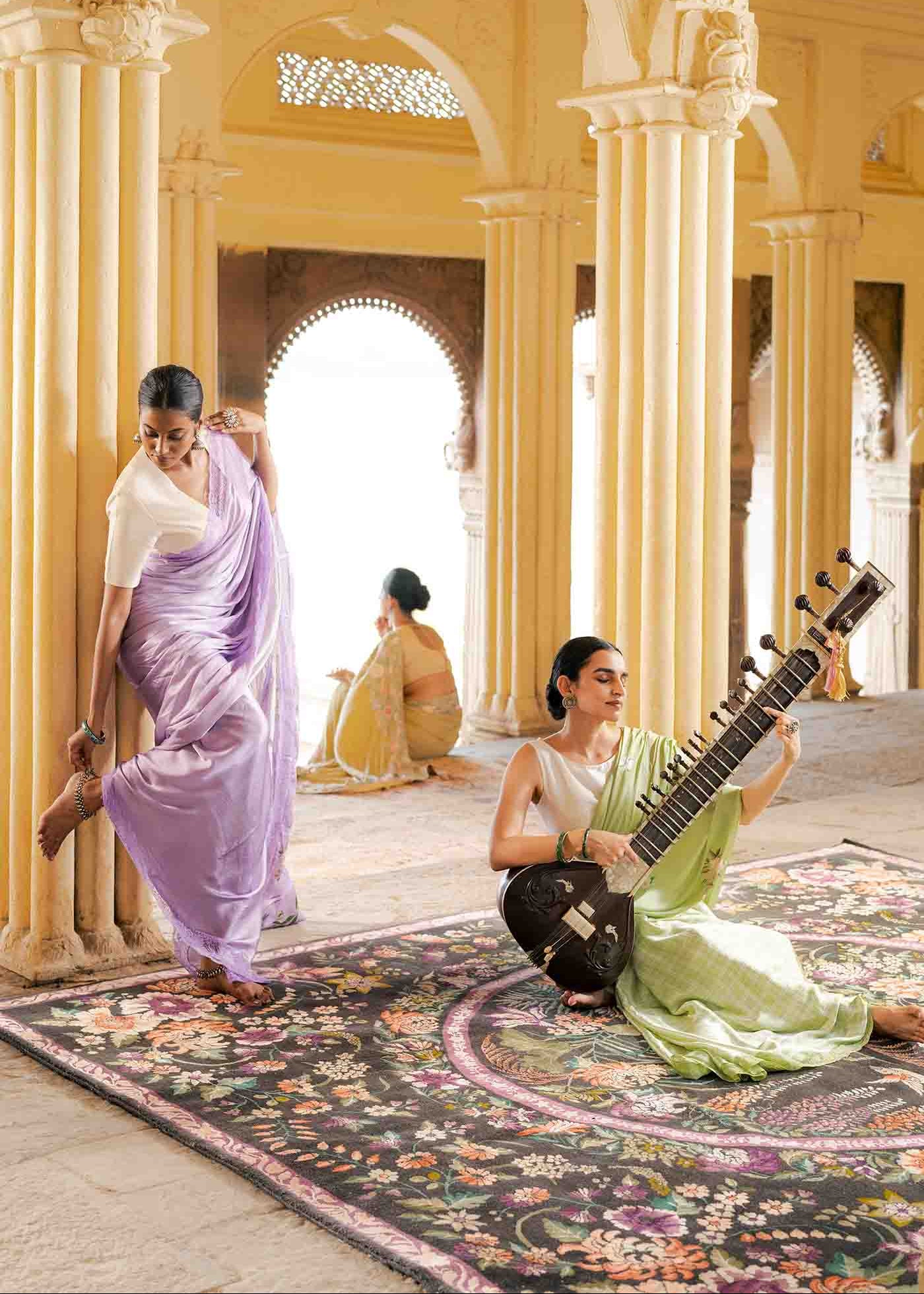
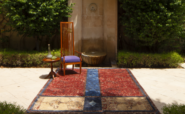
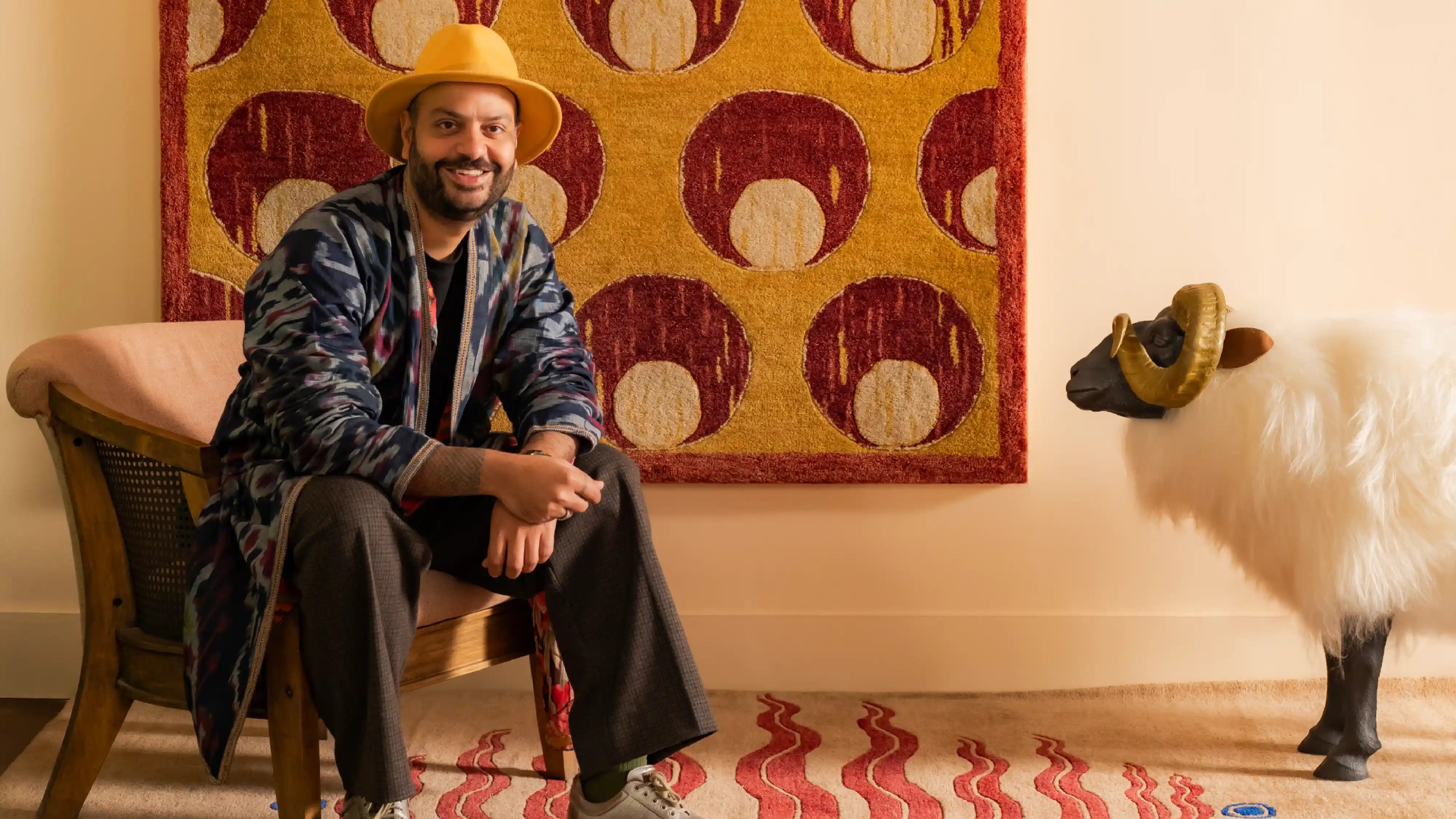
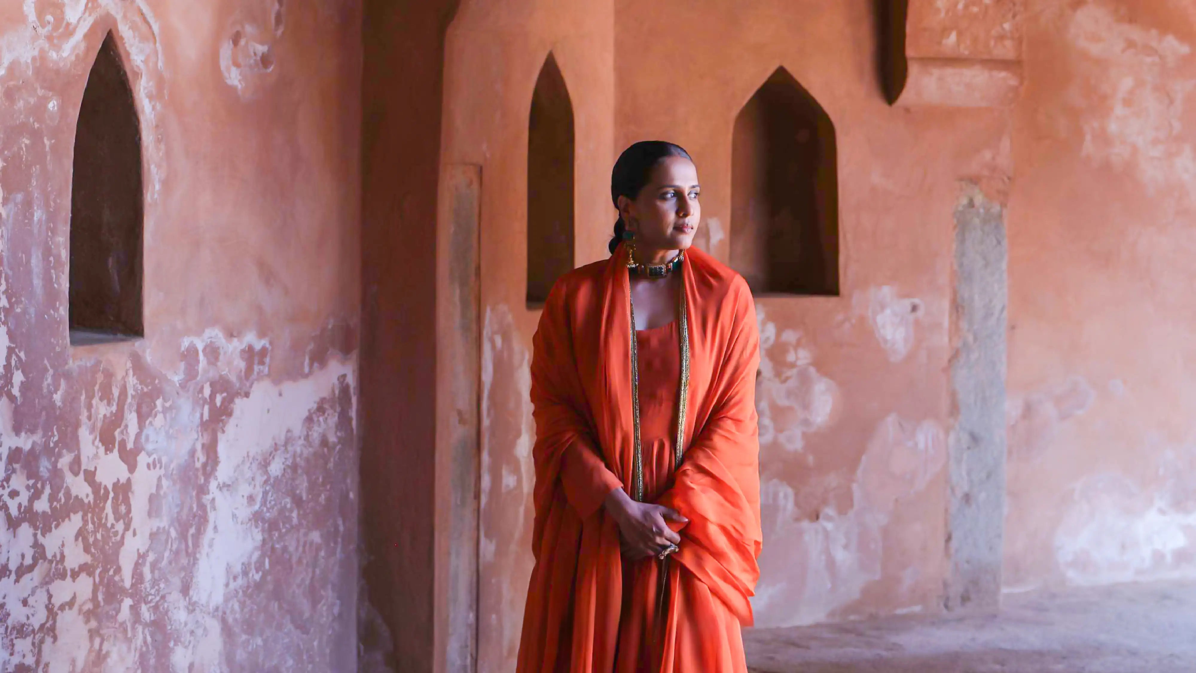
Dark value is the most powerful contributor to visual weight. A rug with a deep navy, charcoal, or black field reads as heavy—it pulls the eye down, grounds the room, creates a sense of density beneath the furniture. This can be exactly what a room needs. A space with light walls, pale upholstery, and generous natural light often benefits from a dark rug that stops the room from feeling unmoored. Dense pattern also adds visual weight. A traditional rug with a complex all-over design—tight boteh repeats, intricate herati field, close-set geometric tiles—presents so much visual information per square metre that it reads as dense, regardless of the actual pile height or construction. Warm colours, particularly deep reds, ochres, and burnt oranges, read as heavier than cool colours of equivalent value. A terracotta field rug and a slate blue rug at the same value level will read differently: the terracotta advances, the blue recedes.
What makes a rug feel light
Pale grounds, open layouts, cool neutrals—these reduce visual weight. A rug with an ivory or bleached ground, sparse border, and minimal field decoration reads as light even if it is physically dense and tightly knotted. The effect is spatial openness rather than grounding. Rug colour impact on a room is most visible in this distinction. A light rug in a room with dark furniture allows the floor to recede, making the furniture appear to float slightly. This can read as elegant restraint or as disconnection, depending on what the rest of the room is doing. Geometric designs with high contrast between ground and motif—particularly those using white or cream heavily—create visual pulse rather than weight. The eye moves across the surface rather than settling into it.

Balancing weight across a room
Rug design balance is not achieved by choosing a medium-weight rug and hoping for equilibrium. It is achieved by reading the room's existing weight distribution and deciding whether the rug should counter it or reinforce it. A room with heavy, dark upholstered furniture, dark walls, and limited natural light may need a lighter rug to prevent the floor from disappearing entirely into shadow. Conversely, a room with white walls, natural wood furniture, and sheer curtains may need a rug with enough visual weight to stop the floor from feeling provisional. The distribution of weight in a room follows the same principles as composition in painting: mass needs to be balanced across the visual field, but balance does not mean symmetry. A heavy rug can work in a light room if the rug's weight is the intended focal point. A light rug can work in a heavy room if the intention is to lift the room's tonality.
Pile height and perceived weight
Physical construction affects perceived weight in ways that are easy to overlook. A high-pile rug has actual depth—it creates shadow within the pile that darkens its apparent value. The same design in a low-pile construction will read lighter, with more of the true ground colour visible. This is relevant when specifying a rug for a room where weight calibration matters. A design that reads well in a medium pile may feel too heavy in a high pile version, or too thin and graphic in a flat weave. The pile height is part of the design decision, not a separate technical specification.
