

Pattern Is Not Decoration. It Is Structure.
There is a tendency in contemporary interior thinking to treat pattern as applied ornament—something added to a surface to make it more interesting. In traditional rug-making, this understanding is inverted. The pattern is not something added to the rug. The pattern is the rug. It is the structural logic that governs how the textile works spatially, compositionally, and symbolically.
Understanding rug patterns meaning, even at a basic level, changes how you read a rug and how you use one.

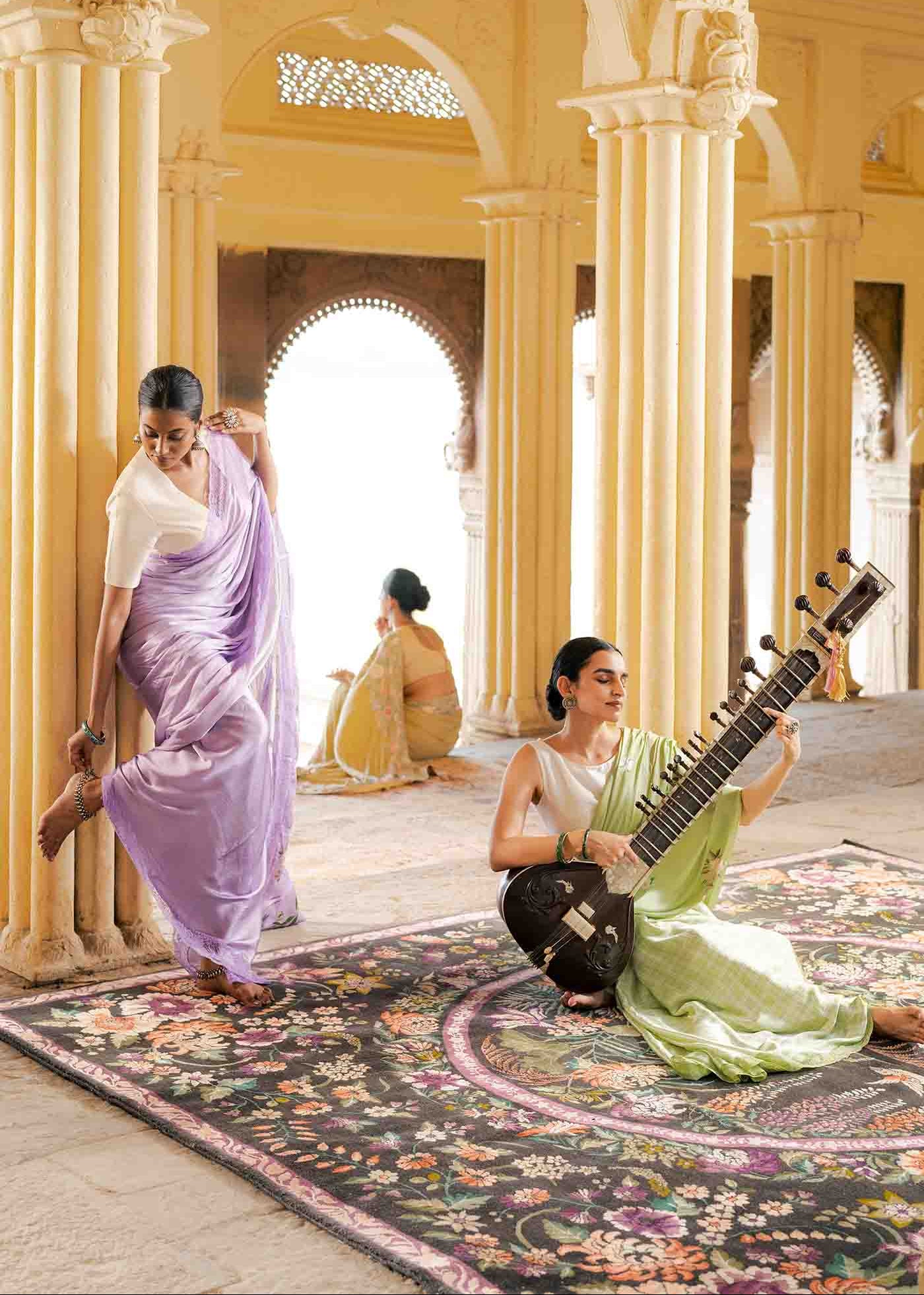
The central medallion is the most recognisable of the types of rug patterns associated with classical Persian and Indian weaving. At its simplest, it is a dominant central motif—usually a geometric or floral form—surrounded by a field and framed by a series of borders. The medallion layout organises the rug as a complete composition: centre, middle ground, frame. Placed in a room, it functions like a painting—it has a clear focal point, a defined edge, and an internal hierarchy that tells the eye where to go first and where to rest. The medallion rug does not merely cover a floor. It centres a room.
In traditional rug design, the medallion often carries symbolic resonance—references to celestial geometry, to garden layouts, to architectural forms. In practice, what matters spatially is the compositional logic: a rug with a strong medallion anchors the furniture arrangement above it and gives the room a visual fulcrum.
The all-over field: continuous rhythm
Where the medallion provides a focal point, the all-over pattern provides rhythm. Types of rug patterns that use repeating motifs across the entire field—boteh, herati, serabend, geometric lattice—create a continuous visual texture. The eye does not lock onto a single point; it moves across the surface.
This makes all-over patterned rugs highly versatile in large rooms, where a central medallion might look isolated or where the furniture arrangement does not have a single clear centre. The all-over field supports multiple seating groupings, dining arrangements, and circulation paths without favouring any one viewpoint.
The density of the repeat affects the room's tempo. A tightly packed small-scale repeat—boteh on a fine ground, for example—reads as texture from a distance, with the individual motifs becoming legible only close up. A larger, more widely spaced repeat remains readable across the room. Both are valid; the choice depends on how the rug will actually be experienced.
Geometric pattern and the architecture of the floor
Geometric patterns—grids, lozenges, octagons, step forms, star fields—are among the oldest types of rug patterns in existence and among the most spatially precise. They create a grid logic on the floor that responds to the architecture of the room: they align with walls, they parallel furniture lines, they make the floor legible as a plane.
In traditional rug design across the Caucasus, Central Asia, and parts of India, geometric patterns are not simplified versions of floral designs. They are a distinct formal language with their own grammar. The step pattern that forms a diamond in a Caucasian rug is not a crude medallion; it is a precise geometric construction with specific proportional relationships between the motif and the ground.
Geometric rugs tend to read as more graphic and contemporary, though the designs themselves are often centuries old. They work well in rooms with strong architectural lines—defined spaces with regular proportions, rectilinear furniture, and deliberate colour palettes.
Borders as architectural frame
The border of a traditional rug is not merely an edge treatment. It is the frame that makes the field legible. In classical rug design, the border system—main border, guard borders, inner guard—functions like the frame of a painting: it contains the composition, separates it from the surrounding floor, and provides a visual transition between the rug's world and the room's world. The rug patterns meaning embedded in borders is often as complex as that in the field. Running vine borders, reciprocating wave patterns, kufic script borders, cartouche borders with floral reserves—each has a formal history and a spatial function.
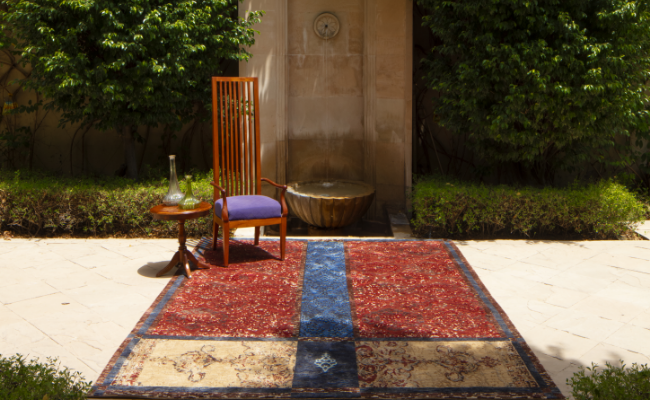
In spatial terms, a strong border makes a rug read as an object placed on the floor rather than a section of floor covering. A rug without a clear border—or with a very minimal border—tends to merge with its surroundings. Both effects can be useful; the choice is about whether you want the rug to declare its presence or integrate with the room.
Reading a rug before placing it
The practical implication of understanding pattern as structure is that before placing a rug, it is worth understanding what compositional logic it carries. A medallion rug wants to be centred. An all-over rug is more flexible. A geometric rug with strong directional lines should be oriented in relation to the room's dominant axes.
Pattern is not an afterthought. It is the primary means by which a rug organises a space. Weavers have worked with this understanding for generations. It is worth approaching rug selection with the same clarity.

What Makes a Rug Feel Right in a Space
The question people ask most often about rugs is: which one should I choose? It is the right question, but it is usually asked too late—after the furniture is arranged, after the palette is fixed, after the room has already taken shape. A rug selection guide that starts from scratch is more useful than one that tries to retrofit a rug into a room that was designed without one. That said, most people are working with existing spaces. So the practical answer to how to choose the right rug begins with three things: size, value, and movement.
Size is the first decision
Undersizing is the single most common error in rug selection. A rug that does not reach under the front legs of the sofa, that floats in the middle of a seating area like an island, that leaves a wide margin of bare floor around the furniture—that rug is not working. It is simply present. For a rug for the living room, the standard guidance is that at minimum the front legs of every major piece of furniture should sit on the rug. Ideally, all legs do. The rug should be large enough that it reads as a platform for the seating arrangement, not as a floor covering that happens to be nearby.
In a dining room, the rug must extend at least 60 to 70 centimetres beyond the chair legs on all sides when the chairs are pulled out. A rug that works only when chairs are tucked in will look wrong every time the room is used.
Value does more than colour
When people talk about rug colour, they are usually thinking about hue—whether the rug is warm or cool, whether it picks up a colour from the curtains or cushions. That matters, but value matters more.
Value is the lightness or darkness of a colour. A dark rug in a room with pale furniture and light walls creates contrast and definition. A light rug in the same room blends the floor into the rest of the space, making it feel larger and more continuous. A mid-toned rug—one that sits between the floor colour and the furniture—tends to recede without disappearing.
The relationship between the rug's value and the room's overall palette determines whether the floor becomes a focal point or a supporting element. Neither is wrong. But the choice should be deliberate.
Movement and stillness
Every rug has a visual tempo. An all-over pattern with small repeating motifs—a serabend, a boteh, a fine geometric—has consistent, medium-frequency movement. A large medallion rug has a clear focal point and relative stillness in the field around it. A rug with bold, high-contrast stripes or large abstract forms has strong movement that commands the room.
This visual tempo needs to match what the room is doing. A room with a lot of pattern in its textiles—patterned upholstery, printed curtains—usually wants a rug with lower visual frequency, something that reads as textured rather than patterned. A plain room can absorb a more active rug.
The rug selection guide that works in practice is this: look at the room as a whole and ask where the eye is currently going, and where you want it to rest. The rug should answer that question, not complicate it.
Construction and context
The technical construction of a rug is also relevant to how it fits a space. A hand-knotted wool rug has surface depth—the pile catches light differently depending on direction, giving it a quality that changes throughout the day. A flat-woven kilim has no pile and reads as a graphic surface, sharper and more two-dimensional.
Neither is universally better. A hand-knotted rug is appropriate in a room where texture and warmth are the goal. A flat weave works well in a room where pattern and crispness matter more, or where a low-profile textile is practical.
High-traffic areas—entrance halls, kitchen adjacencies, family rooms—generally perform better with tighter constructions and more muted or complex patterns that do not show wear or soiling as readily. This is not an aesthetic compromise; it is a practical one that prevents the rug from looking wrong before its time.
